Showing posts with label Lonny. Show all posts

Wednesday, April 17, 2013

[color kreyv]: Beige

Just when I think I'm over a color, I see a beautiful space, and it totally changes my outlook. I'm not really over beige, I'm just over the shade of beige in my own home. I have a feeling that would be the case regardless of the color. After all, it's been that way for almost three years. Don't we get to change the color of our house every three years? That was my understanding. Anyway, these spaces are absolutely gorgeous. The soft beige with the white gives contrast, but it's not an in your face contrast. Make sense? Probably not. I've had one of those days where I haven't stopped going. I'm exhausted. It's late, and I'm rambling...and by late, I mean 9:21.  I'm a wild one, that's for sure.
image from Linda McDougald Design via Decor Pad
image from Lonny
image from Decor Pad

Friday, January 6, 2012

[kreyv of the day]

image from Lonny Mag

Wednesday, November 16, 2011

[color kreyv]: Turquoise

In honor of my guest post today at The Turquoise Piano, I thought I would feature more turquoise. Kelli obviously loves turquoise, and I don't blame her one bit. It's pretty much amazing and it goes with everything. (Speaking of amazing, let's talk about that art in the first picture. How hard could it be? Someone should make it. I would, but I'm out of walls, and the hubs is out of patience.) Anyway, Kelli is a super talented DIYer. We also went to middle school and high school together, which makes her extra cool. So go check out her blog! (That sounded bossy. Let me rephrase, if you would like to, you should visit her blog. I strongly recommend it. Better, right?)
image from Lonny Mag
image from Phoebe Howard
image from Studio Ten 25

Tuesday, February 1, 2011

Mixing it Up in the Bedroom

I'm personally an all-white linen type of girl when it comes to bedding, BUT I do love mixing prints. Mixing prints is a good way to achieve a layered, collected look rather than a, "Hey, I just bought a bed in a bag," look. Remember when you used to look through the JC Penney catalog, and they had rooms with matching comforters, dust ruffles, pillows, curtains, chairs, rugs, wallpaper, and anything else you can think of? Let's not do that anymore. Mom, it's okay that you did it, because it was 1994, and I know you won't do it again.

As for mixing prints, go for it! Be creative. The secret to mixing prints is all about scale and pattern. Geometric prints look great with floral prints. Or, try a large geometric print with a small geometric print. Try to master the art of "I just threw these prints together without even thinking about it," when really it took A LOT of thought! Mix it up!


all images from Lonny Mag

Thursday, January 20, 2011

Lonny Mag's 5 Trends for 2011

Michelle Adams from Lonny Magazine appeared on the Nate Berkus Show to feature the top five trends for 2011. So, if you're looking to add a little somethin' somethin' to your pad, here are the latest and greatest!
[five]: MIRRORED ACCENTS

image from Elle Decor


image from Decor Pad


image from Design Ties


[four]: TYPOGRAPHY

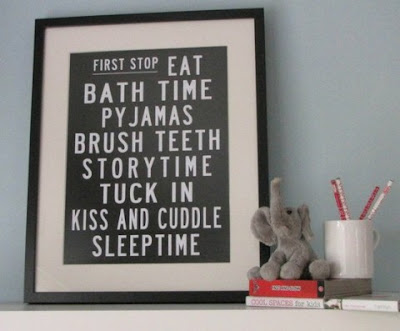
image from Swiss Miss


image from Design Sponge

[three]: STORAGE ART

image from Martha Stewart

image from Martha Stewart

image from Martha Stewart

[two]: MID-CENTURY LIGHTING

image from Gear Patrol

image from Decor Pad

[one]: RUST
image from Morgan Harrison


image from The Lennox

image from Pottery Barn