Showing posts with label design tips. Show all posts

Thursday, July 17, 2014

Simple Styling

Remember this post--a how-to on how to create a vignette? In case you forgot, or in case you really don't read this blog and just look at the pictures, here it is again: When creating a vignette, the easiest way to do it is to remember the tall, medium, short, layer, layer, layer rule. If you just look at the pictures, I realize you will miss this again. BUT for everyone else, start your vignettes with three items: one tall, one medium, one short, then add other elements to add depth, character, and texture. Check out the below pics for inspiration and style away!
image from Stylizimo
image source unknown
image from Savvy Southern Style

Tuesday, April 8, 2014

What's Your Favorite Color?

Is your favorite color in your home? Is this same color in your wardrobe? I thought about this last night when I ordered four new shirts: two white, one cream, and one mint. I'll be honest, the mint one was a stretch for me, and though I really like it, I ordered it, because I "need" more color in my wardrobe.  I know. I'm crazy like that, buying a mint shirt and all. Anyway, there's a point to this post...

This same thing happens all the time with design clients. They tell me that they really like certain colors, but that they "need" to use something different in the next room.  Here are my thoughts: You don't "need" to use different colors in every room. If you are drawn to certain colors, use those colors in your home. I love all of these rooms from the very colorful, to the pastel, to the neutral. But, I am definitely drawn to some more than others. Buy what you like, just because you like it, not because it's a certain color that you "need". I promise you, you'll like your house a lot better, because it will be more you. Plus, you won't end up painting a room yellow, and then covering it up with tan the very next day. I've heard that's kind of a bummer.  What's your favorite color?
image from FreshGoo
image source unknown
image from Daniella Witte
image from Home Life
image from Rachel Whiting

Monday, February 24, 2014

Tips for Boy & Girl Shared Rooms

Nothing scares a client more than transforming a girl or boy room into a boy AND girl room. Trust me, it's not as daunting as it may seem. Unexpected? Maybe, but daunting, no. Here are a few of my tips:

one | Create zones. The trick to "zones" is to use symmetry to balance the room.

two | Add personal touches.  Even though the room is for two, make sure each child has his or her own personal touches in the room.

three | Use a neutral color palette, and purchase furniture that is neither too masculine nor too feminine.

In summary, use neutral colors, symmetry, and personal touches.  And be happy that the kids are sharing rooms with each other and not with us--although, I'm pretty sure Stella thinks our room is hers every time she tries to sneak into bed with us, which I secretly like. Until I get a kick in the head.
image from Babble
image source unknown
image from Grant K. Gibson Design via Decor Pad
image from Land of Nod

Wednesday, November 13, 2013

Shopping the House | Five Things You Already Have

Do you kind of hate it when people tell you to shop your house? You're like, "Really? You're telling me I'm going to find some awesome piece of awesomeness that I've forgotten about? Yeah right."  If you're like me, I'm using pretty much everything…no new discoveries, just like there is nothing new in my pantry--regardless of how many times I open and shut it. (Yet, I continue to do it.) I am willing to bet, however, that you have most of these items in your home, so get them out and use them!

1 | Sticks: Yes, I may have a slight obsession with sticks, everyone knows it. The other day, my three year old gifted me a stick, because "Mommy loves sticks." Sticks are cheap…free to be exact, and they add a natural element, height, and texture. 
image from Kat Teutsch Styling
image from Lantliv
2 | Blankets & Throws: Blankets and throws add a sense of warmth and add texture, color, and print to a space. Whether they're thrown over a chair, sofa, or bed or folded up on a shelf, basket, or piece of furniture--they're an easy addition.
image from Apartment Therapy
image from West Elm
3 | Dishes: Plates, bowls, and other serving pieces are a great way to fill open shelving or other areas in the kitchen or dining room. Stacking items gives a sense of collection and character.
image source unknown
image from House & Home
4 | Frames: Creating an eclectic gallery wall is a great way to add personality to a space.  Frames of all different sizes, colors, and textures can come together to make a major statement.
image from Desert Domicile
image from Style Me Pretty
5 | Books & Magazines: Books and magazines are a great way to add interest to a room. Stack books forward, backwards, sideways, or upright. Magazines can be stacked, collected in bowls, baskets, or trays, or even thrown over hangers or ladders.
image from Stylizmo
image from Todd Waterbury

Monday, October 21, 2013

All About the Accessories

Accessorizing or styling a home is definitely the bringing-it-altogether component of a room. Styling is what gives character, personality, quirk, and depth to a space. It takes a space to the next level. Unfortunately, styling is what scares a lot of people or at least leaves them at a stand still. Clients often tell me that they have a hard time bringing a room together. The good news? There's nothing to be scared of. Chances are, you have a lot of items around your house that you could use. The more random and unique, the better! Here are a few quick tips when styling:

1 | Choose items that represent you, have meaning, or that you love.

2 | Remember the tall, medium, short, layer, layer, layer rule. Check out this post for more deets.

3 | Take your time. This is the hardest one for me. I have a tendency to want to hurry and "finish" a room. But, at the same time, I want to love the items in it. Don't buy items to fill a space, buy items to make a space represent you and your aesthetic.
image source unknown
image from Frog Goes to Market
image from Style at Home

Monday, October 14, 2013

Dark Leather | Light Space

Leather is dark. I know...hello, Captain Obvious, but stick with me. Leather itself is heavy, and that translates into your design. So...how do you lighten up your design? Add light and white tones, of course. I love these spaces. They are a great example of how a dark, leather couch doesn't have to make the entire space look dark and heavy. The leather doesn't control the room. It's all about balancing color, textures, and even materials. I, of course, love leather with black and white, because, well, I love natural neutrals (i.e. woods, leathers, natural fibers, etc.); I love black and white; and I love mixing the two.  Give it a try. Show that leather couch who's boss!
image from Pony Rider
image from Restoration Hardware
image from Helena Blom via Lantiv

Thursday, October 10, 2013

Dressing Your House for Fall via Living Savvy

In case you missed my tips for dressing your house for fall, here they are. Check out the rest of Tiffany's series over at Living Savvy -- lots of great bloggers, lots of great tips, and lots of fall goodness.

one | Bring elements of the outside in. I love implementing nature into my decor, and fall provides tons of (free) resources. Try using leaves, pinecones, pumpkins, or branches into your home decor or table settings.  

two | Personalize items to add sophistication and a sense of individuality. I love a good monogram or a personalized place card any time of year!

three | Add layers. Layers provide personality and warmth to a space (or table setting in this case).  Layers are a good way to add color, texture, and character.

four | Light some candles. Candlelight not only adds dramatic lighting, but also makes a space feel intimate and warm. 

five | Don't be afraid of color.  Any color. Don't feel like you have to stick to a certain color palette for fall or the holidays. 

Wednesday, September 4, 2013

Here & There | Vignettes

Remember the post, How to Create a Vignette? Well, I've (finally)been styling this place, and I wanted to show that I, unintentionally, followed the tall, medium, short trick. Every. Time. 

People always tell me that they get stuck when they try to style their homes. It's easier than you think, just be confident...but not confident enough that you'll put me out of work. (Wink, wink!) Styling your home is going to take it to the next level. These final touches give personality, warmth, and interest. If you're stuck in your styling, give the tall, medium, short trick a try. It's super easy, and you can probably even shop your house for the items. Almost anything will work. I mean, really, I've used rolling pins, pencils, and rocks here, people.  Don't even get me started on my stick collection.


Wednesday, August 28, 2013

How to Hang an Ikea Gallery Wall

This was a project and a half...but it's done(ish). (The hardest part was the planning, so hopefully, this post helps someone create a gallery a little bit quicker than we did.) The first issue was figuring out how to hang 12 Ikea frames consistently and evenly. If you're familiar with their frames, they include a wire kit, which is super easy unless you are hanging 12 pictures that need to be straight and evenly spaced. Mr. Hubs and I came up with the idea of using wood to create a mount. Now, this is where the story gets blurry. I think that I came up with the idea of attaching the furring strips to the wall, but Mr. Hubs thinks it was his idea. Since I'm the author of this blog, I'm totally going to take credit for it, mmmkay? I mean, really, I didn't help with anything else, so I have to take credit for something. Actually,  I take that back. I unwrapped the frames and gave encouragement. Those things are really what made this happen. So, this is what we did...
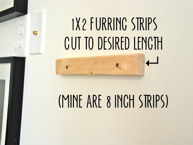
We laid the frames on the floor to figure out the spacing. Of course, everything was ten times harder, because of the cable and electric outlet that live right in the middle of the wall. (Why do outlets hate me?) After adjusting the spacing again (and again) and reassuring Jeremy that I did not need to hire someone to finish this, Mr. Hubs attached 12 1x2 inch furring strips (cut to 8 inches) to the wall, using a level to make sure they were, well, level. The great thing about using furring strips, is that you can slide the picture from left to right if you need to adjust it.
Once all 12 furring strips were attached to the wall, Jeremy predrilled small holes into the tops of every frame. At this point, we were finally ready to hang the pictures. Each frame was hung, and then attached to the top of furring strip with a small screw. (Well, actually only 11 were hung, since one frame was dropped. Not to point fingers, but it wasn't by me.) Each frame has a tiny screw in the top of it. We decided this was a must, since the wall is in a high traffic area, and we have littles that come to play at our house. Plus, it's not like I am going to change the pictures very often. After all, they have had the Ikea paper in them for at least three weeks now.
So, there's the gallery. I just need to print some pictures. And what am I going to put in all of these frames, you ask? Well, Stella of course. One can never have too many pictures of Stella!

Wednesday, July 10, 2013

Mixing Prints | Rules, Schmules

A lot of people are scared of mixing prints. And, as with most other things in design, the "rules" are more of guidelines, and at the end of the day, all that really matters is that it looks good to YOU.  If you don't believe me, and you're still a little scurred, here are a few of my tips:

1| If you're not sure if your prints match, try matching your colors. Monochromatic prints will definitely work, and luckily, most fabric lines produce several patterns in the same color, so the work is already done for you. 

2| Find a print you like, and then pull one or two of the colors to find a coordinating print. For example, try starting with a floral print, then add a geometric print in one of the colors from the floral print (i.e. stripes and florals or dots).

3| Think about the scale of the print. Usually, a small scale print pairs best with a larger scale print, and large, contrasting prints (and colors) work well, too. Lots of small scale prints can be too busy and can overwhelm the eye. 

4| When all else fails, don't think at all, just mix as you please!
image from The Hunted Interior
image from Interiors by Lisa Kahn
image from Project Nursery

Tuesday, May 14, 2013

Beds & Windows: Can't We All Just Get Along?

Bedroom windows can be tricky, but don't let them discourage you OR have too much control of your bed placement. A bed in front of a window can definitely work. Just remember: Window treatments should not compete with your headboard or furniture--they need to get along! Here are some tips:

Beds Blocking Windows: If your bed is directly in front of your window, opt for a non-obtrusive headboard. You don't want your headboard to be too tall and block a majority of the light coming in. Remember, they need to get along. If possible, install panels, so that they flank the bed. Try to avoid blocking your panels with your bed.

Windows Above the Bed: I recently worked with a client who had three square windows above her bed. Rather than using full-length panels (that would have been covered by the bed), we opted for pelmet boxes and roman shades similar to what's shown in the House Beautiful picture. This gives a completed look without cluttering the wall behind the bed. 

Windows Flanking the Bed: This one's not as difficult, since you can install two panels on each window. The tricky part comes when there is little space between the bed and the window, and/or the bed and the wall. If this is the case, try using a light or shear panel, so that you are not blocking light. This will also help avoid window treatments that feel too heavy and compete with the headboard and/or nightstands. Another option is using a partial rod and one panel on each window. This gives the illusion of one big window and avoids a feeling of being crowded (especially if you have a headboard, panels, and nightstands to work with). 
image from House Beautiful
image from Atlanta Homes Mag

image from The Lettered Cottage

Monday, April 29, 2013

How to Create a Vignette

When I design a room, I start with the big things: the rug, furniture, window coverings, lighting, etc. The last step is the styling. Styling is what pulls a room together and gives it personality. (Think of it as the jewelry, scarves, and killer stilettos of an outfit.)

Vignettes are a great way to style a room. Every room in your house probably has a vignette or two (or three), whether you know it or not. A vignette is just a display or arrangement. Whether or not design rules exist is debatable, BUT there are definitely certain arrangements, layouts, and designs, that are more visually pleasing. Here's one easy way to create a vignette:  think tall, medium, short, layer, layer, layer.  I actually don't think about "rules" when I design, but when I think of my own house or clients' homes, I find that I've subconsciously used this formula again and again, just because it looks right! Of course, there are several ways to create a vignette, but this way is a great place to start, and it always works!
image from Lilypad Cottage
image from Better Homes & Gardens
image source unknown 
image from Apartment Therapy
Linking up at